
This is the same text written in the pictures above. I am rewriting it here for accessibility and SEO purposes. You don't need to read this again. Thank you for looking over this!
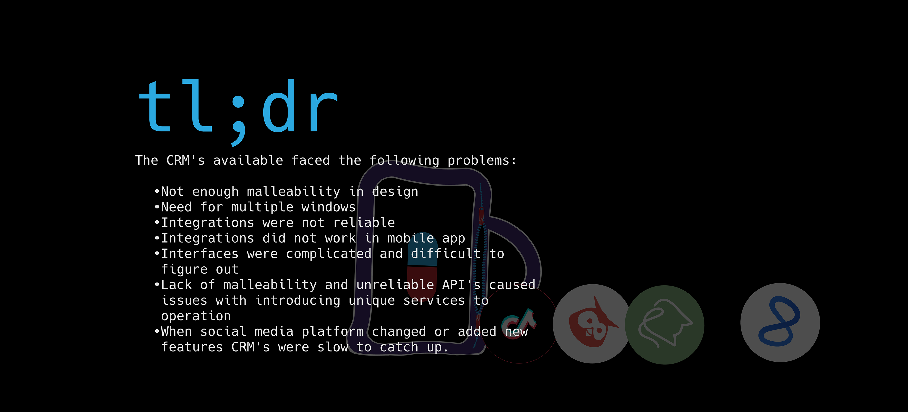
tl;dr
tl;dr
The CRM's available faced the following problems:
Not enough malleability in design
Need for multiple windows
Integrations were not reliable
Integrations did not work in mobile app
Interfaces were complicated and difficult to figure out
Lack of malleability and unreliable API's caused issues with introducing unique services to operation
When social media platform changed or added new features CRM's were slow to catch up.
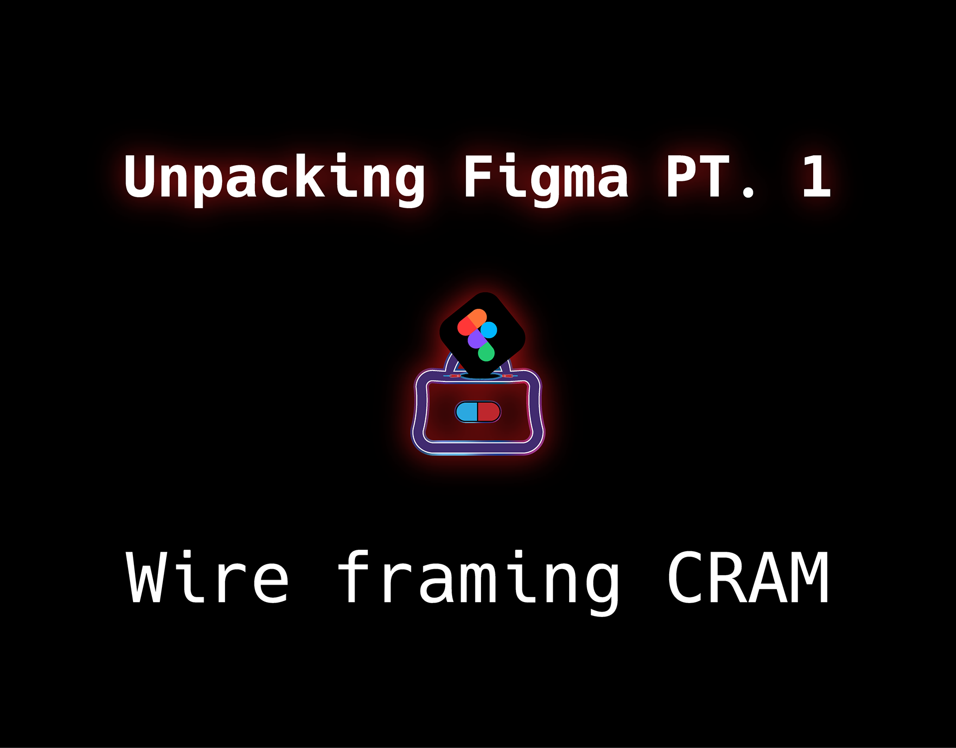
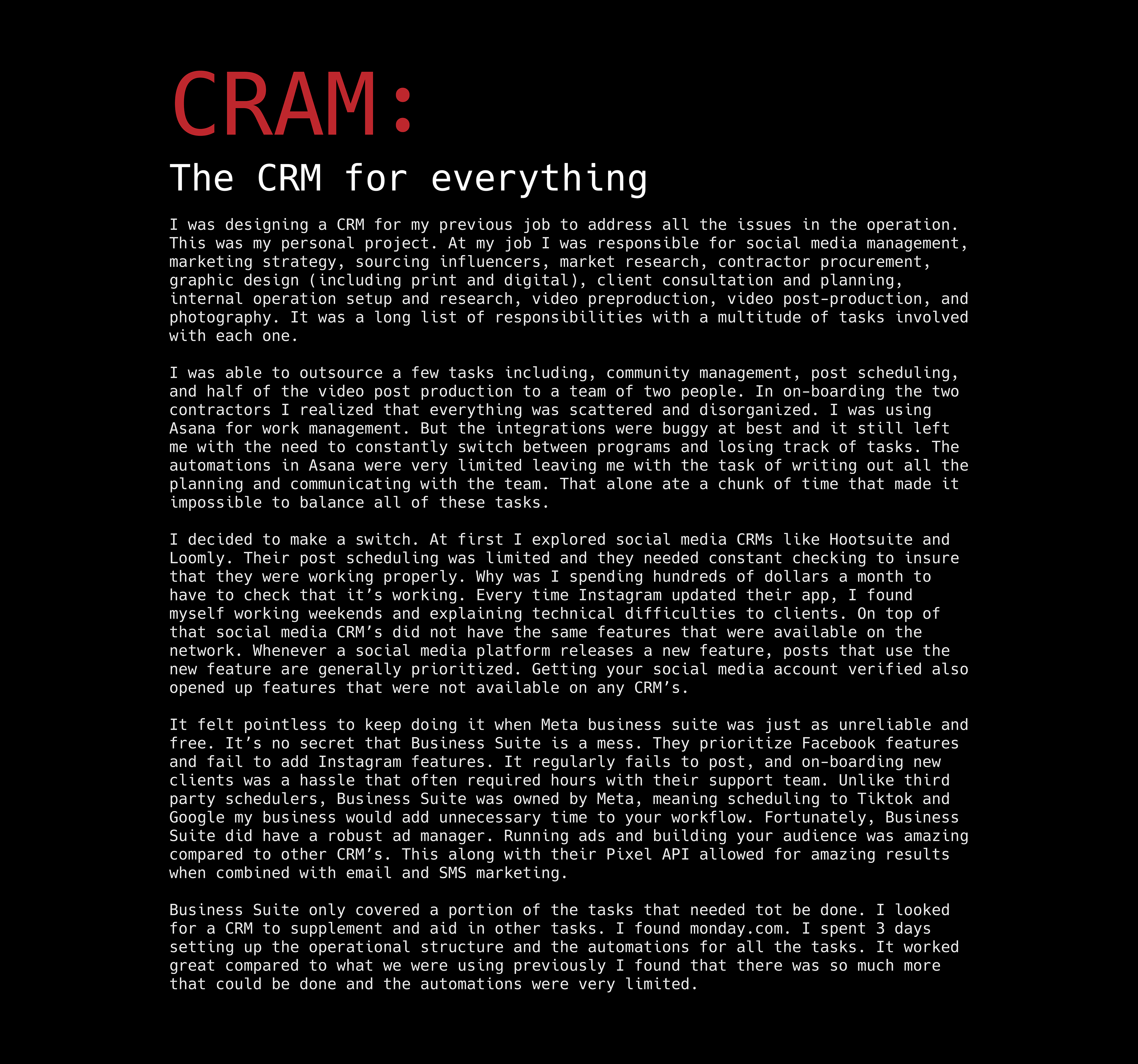
CRAM:
The CRM for everything
I was designing a CRM for my previous job to address all the issues in the operation. This was my personal project. At my job I was responsible for social media management, marketing strategy, sourcing influencers, market research, contractor procurement, graphic design (including print and digital), client consultation and planning, internal operation setup and research, video preproduction, video post-production, and photography. It was a long list of responsibilities with a multitude of tasks involved with each one. I was able to outsource a few tasks including, community management, post scheduling, and half of the video post production to a team of two people. In on-boarding the two contractors I realized that everything was scattered and disorganized. I was using Asana for work management. But the integrations were buggy at best and it still left me with the need to constantly switch between programs and losing track of tasks. The automations in Asana were very limited leaving me with the task of writing out all the planning and communicating with the team. That alone ate a chunk of time that made it impossible to balance all of these tasks. I decided to make a switch. At first I explored social media CRMs like Hootsuite and Loomly. Their post scheduling was limited and they needed constant checking to insure that they were working properly. Why was I spending hundreds of dollars a month to have to check that it’s working. Every time Instagram updated their app, I found myself working weekends and explaining technical difficulties to clients. On top of that social media CRM’s did not have the same features that were available on the network. Whenever a social media platform releases a new feature, posts that use the new feature are generally prioritized. Getting your social media account verified also opened up features that were not available on any CRM’s. It felt pointless to keep doing it when Meta business suite was just as unreliable and free. It’s no secret that Business Suite is a mess. They prioritize Facebook features and fail to add Instagram features. It regularly fails to post, and on-boarding new clients was a hassle that often required hours with their support team. Unlike third party schedulers, Business Suite was owned by Meta, meaning scheduling to Tiktok and Google my business would add unnecessary time to your workflow. Fortunately, Business Suite did have a robust ad manager. Running ads and building your audience was amazing compared to other CRM’s. This along with their Pixel API allowed for amazing results when combined with email and SMS marketing. Business Suite only covered a portion of the tasks that needed tot be done. I looked for a CRM to supplement and aid in other tasks. I found monday.com. I spent 3 days setting up the operational structure and the automations for all the tasks. It worked great compared to what we were using previously I found that there was so much more that could be done and the automations were very limited.
Feasibility
I wasn’t sure where to start with developing this idea. I decided to start by asking Chat GPT and DeepSeek how I would begin to code the features that I wanted. They both gave me valuable insights into the process as well as the roadblocks that would come with creating the solution I had in mind. I talked all the features through with the AI’s and they coded all the back end features that I needed. When it came time to design the UI they were both lacking. That’s when I decided to jump into Adobe XD and build my own prototype. With Both AI’s capable of looking at design links I figured I could just share it with them and we could start from there.
When I presented the great AI’s with my prototype they were both unable to look through the link and interact with it. I was going to export the XD file to SVG files and have them code the HTML from there. There are plenty of plug-ins that allowed me to export HTML directly from the XD app, however I didn’t know how to compile and integrate the code. I asked them what the best way to show them an interface was and both AI’s said that Figma was the best option. There was no easy way to export XD files to Figma I had been putting off learning Figma. XD’s shortcuts and structure was closer to the rest of the Adobe Creative Cloud Suite. I started the same way I did with XD and any other software and explored the different features. I grew frustrated with the software as I fell into old habits I developed while using Illustrator and XD. I turned to LinkedIn for a structured lesson in the basics and YouTube university for specific roadblocks.
Best Practices
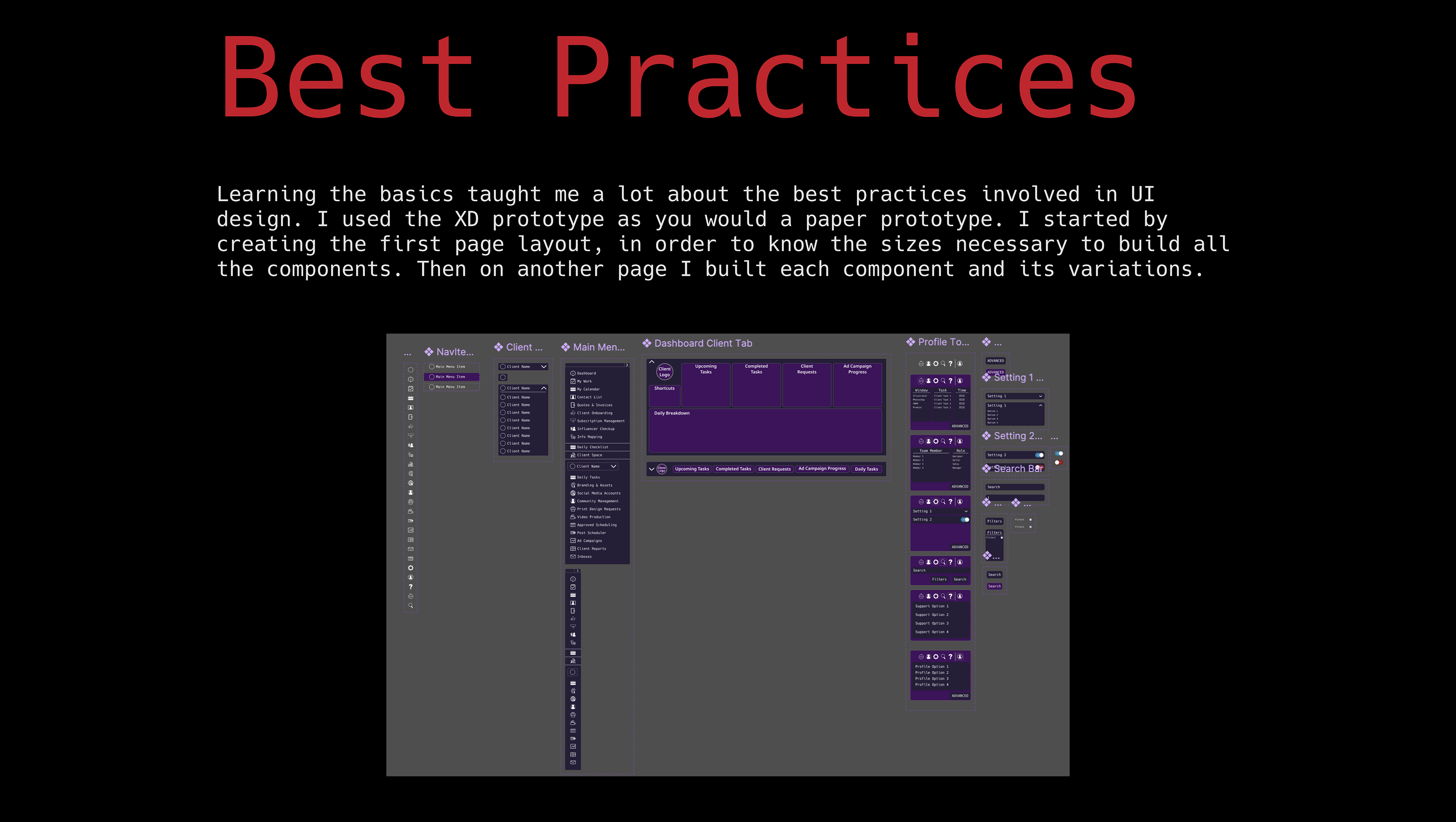
Learning the basics taught me a lot about the best practices involved in UI design. I used the XD prototype as you would a paper prototype. I started by creating the first page layout, in order to know the sizes necessary to build all the components. Then on another page I built each component and its variations.
Icons
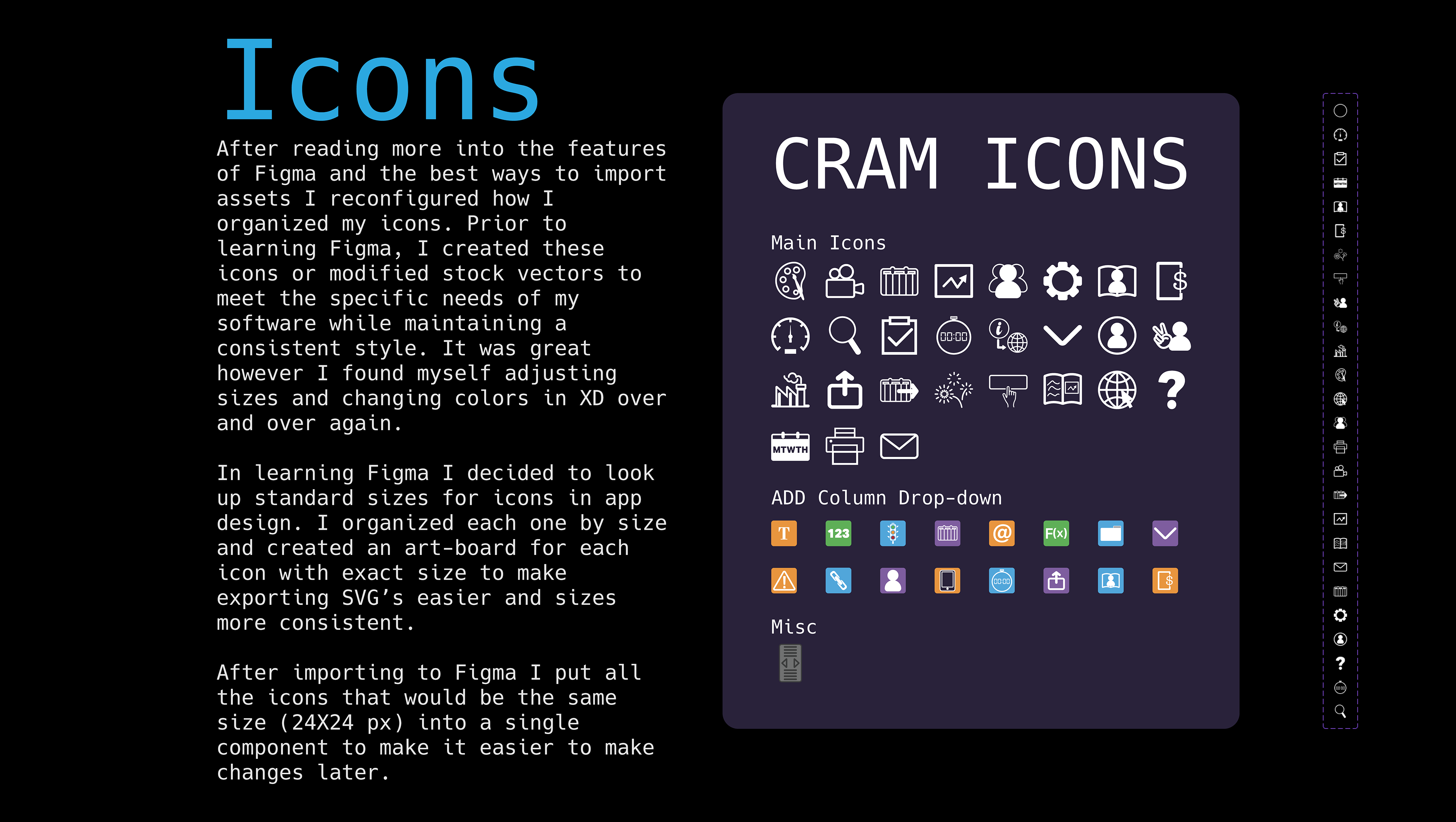
After reading more into the features of Figma and the best ways to import assets I reconfigured how I organized my icons. Prior to learning Figma, I created these icons or modified stock vectors to meet the specific needs of my software while maintaining a consistent style. It was great however I found myself adjusting sizes and changing colors in XD over and over again. In learning Figma I decided to look up standard sizes for icons in app design. I organized each one by size and created an art-board for each icon with exact size to make exporting SVG’s easier and sizes more consistent. After importing to Figma I put all the icons that would be the same size (24X24 px) into a single component to make it easier to make changes later.
More Components
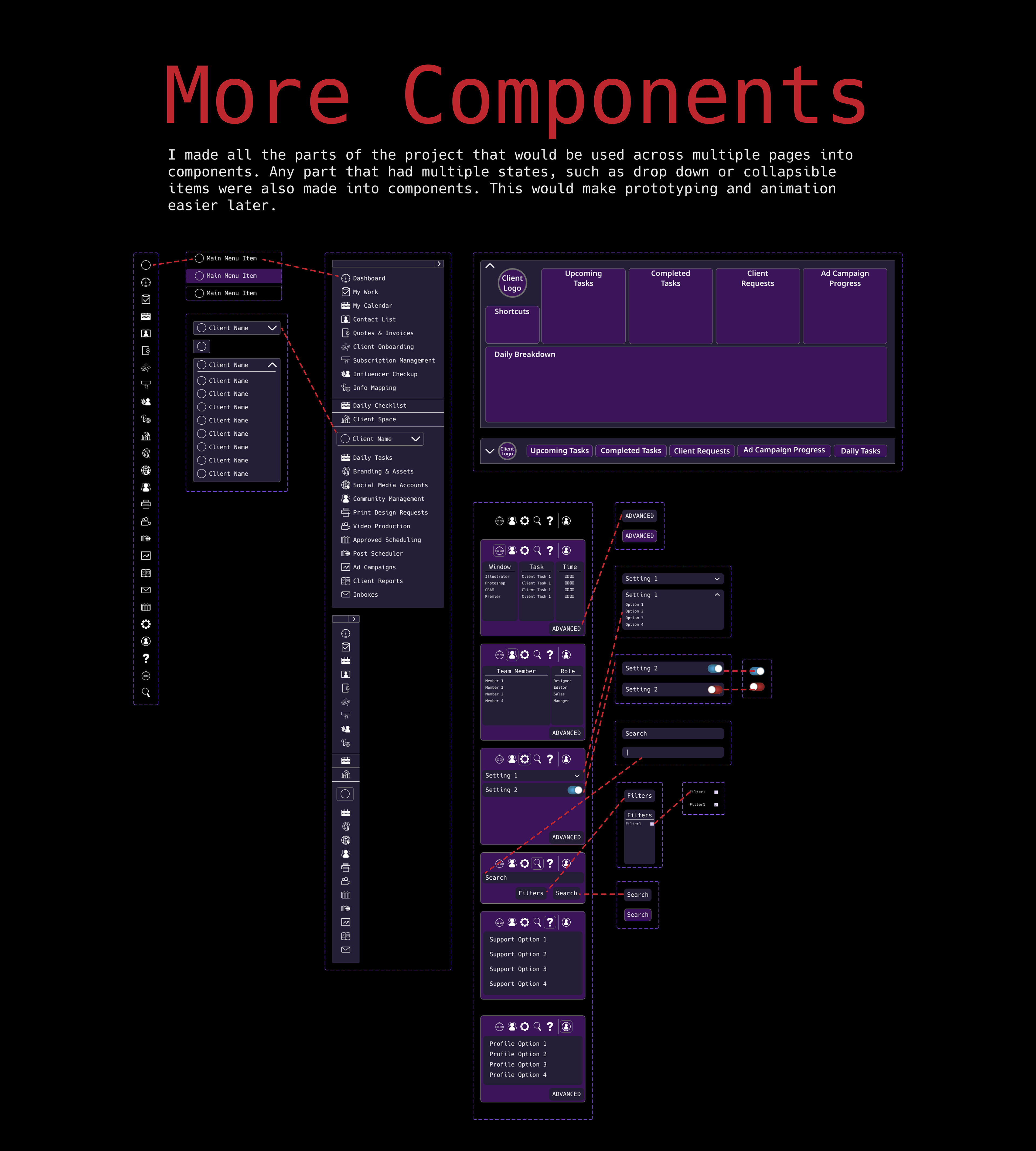
I made all the parts of the project that would be used across multiple pages into components. Any part that had multiple states, such as drop down or collapsible items were also made into components. This would make prototyping and animation easier later.
Local Styles
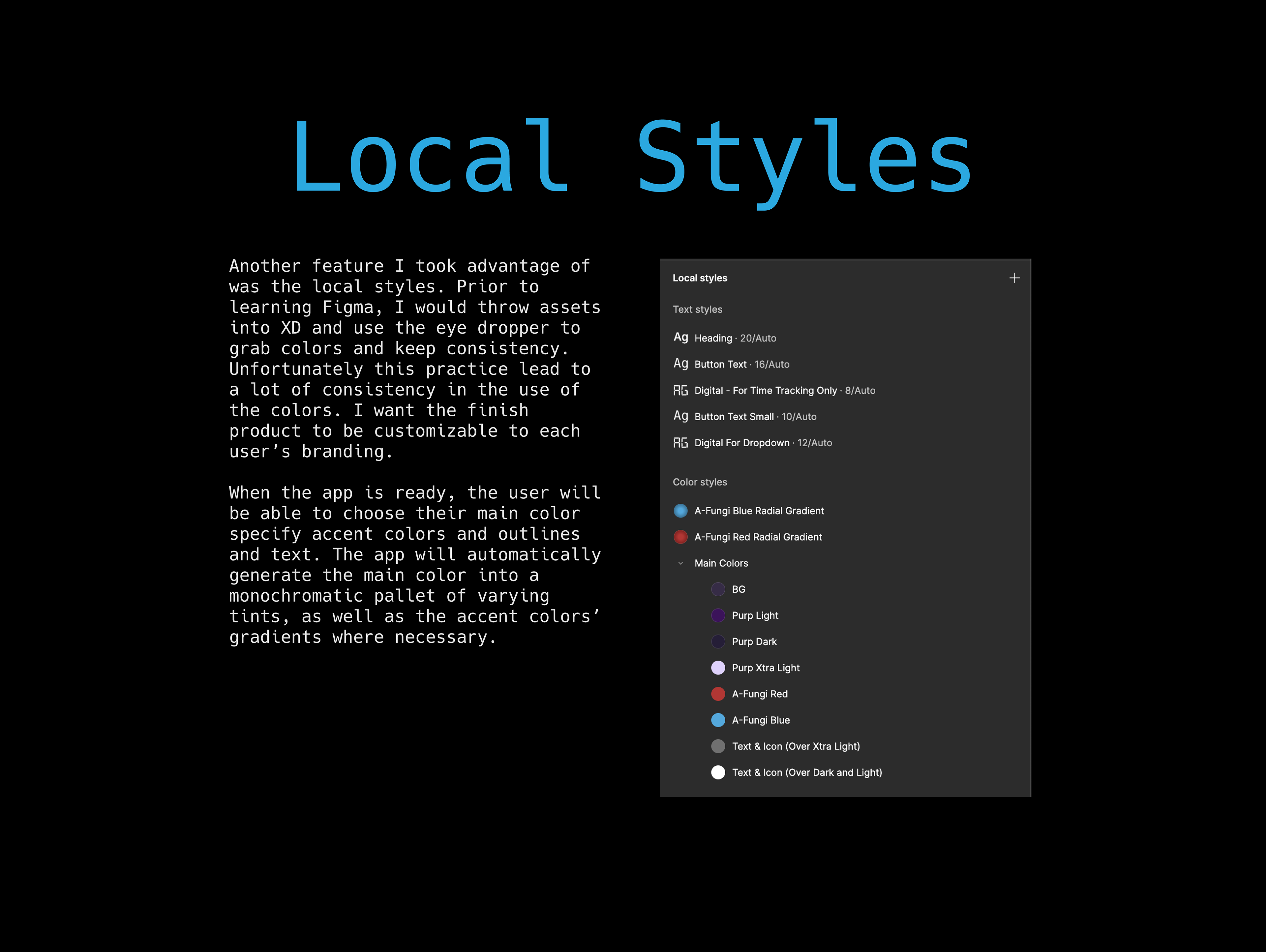
Another feature I took advantage of was the local styles. Prior to learning Figma, I would throw assets into XD and use the eye dropper to grab colors and keep consistency. Unfortunately this practice lead to a lot of consistency in the use of the colors. I want the finish product to be customizable to each user’s branding. When the app is ready, the user will be able to choose their main color specify accent colors and outlines and text. The app will automatically generate the main color into a monochromatic pallet of varying tints, as well as the accent colors’ gradients where necessary.
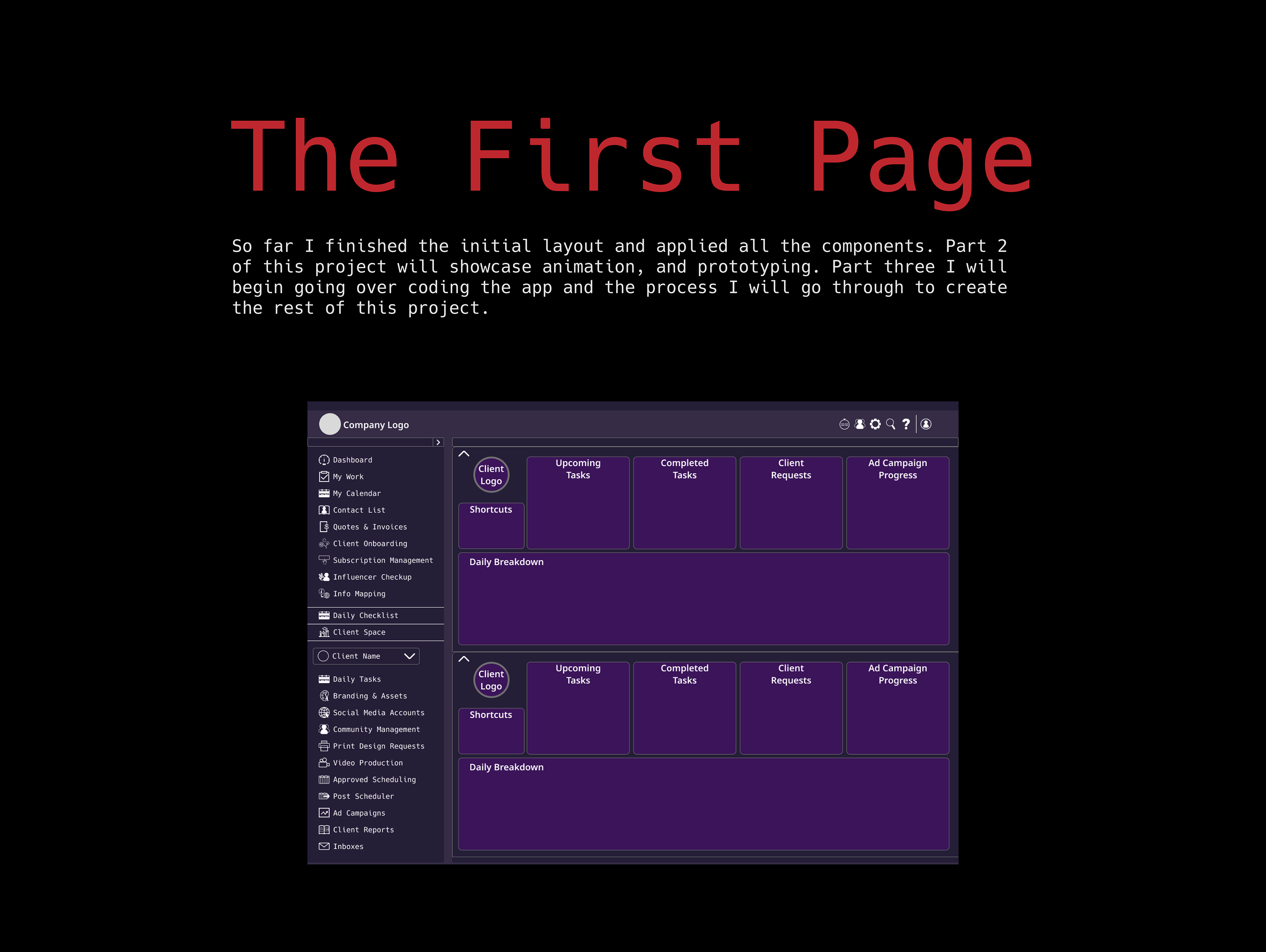
The First Page
So far I finished the initial layout and applied all the components. Part 2 of this project will showcase animation, and prototyping. Part three I will begin going over coding the app and the process I will go through to create the rest of this project.