Giving the full branding kit to this client really showed me the value that is added to a logo when you build on their brand. Nobody needs just a logo. They might think that's all they need but taking it the extra mile and showing them your process, educates them on the time and effort that goes into the finish product. It's what takes them from enjoying art to appreciating art.
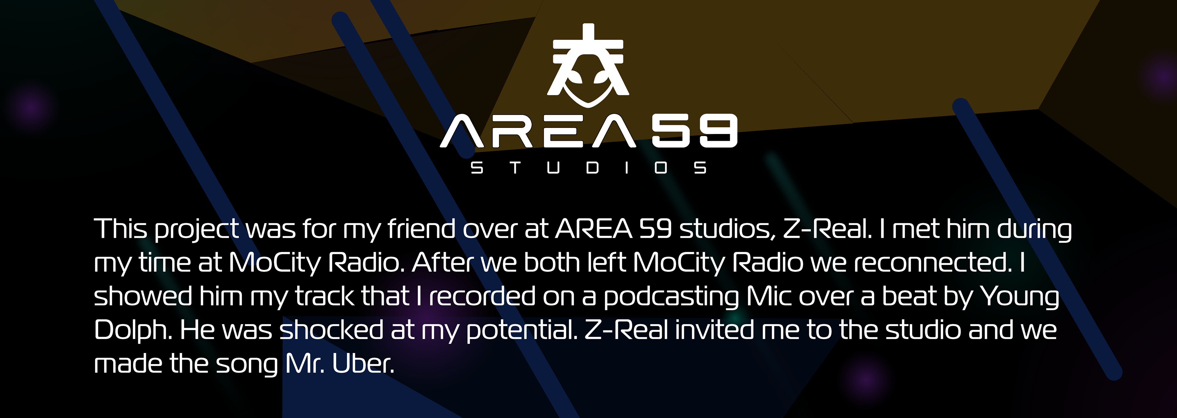
This project was for my friend over at AREA 59 studios, Z-Real. I met him during my time at MoCity Radio. After we both left MoCity Radio we reconnected. I showed him my track that I recorded on a podcasting Mic over a beat by Young Dolph. He was shocked at my potential. Z-Real invited me to the studio and we made the song Mr. Uber.
Around a year later, Z-Real was opening a new studio and he needed help getting his marketing started. I put together some brand guidelines and advised him where to start on content creation in order to give him a base line for brand continuity as his business grew.
To start things off I sent him a catalog of AI generated logos to help me understand his taste and what direction he wanted to do take his brand. Then I found a font similar to the one he liked the most and started working on the brand mark. The previous logo had an alien smoking a blunt and drinking and holding a drink. Z-Real wanted the brand to take on the same theme with a more professional tone.
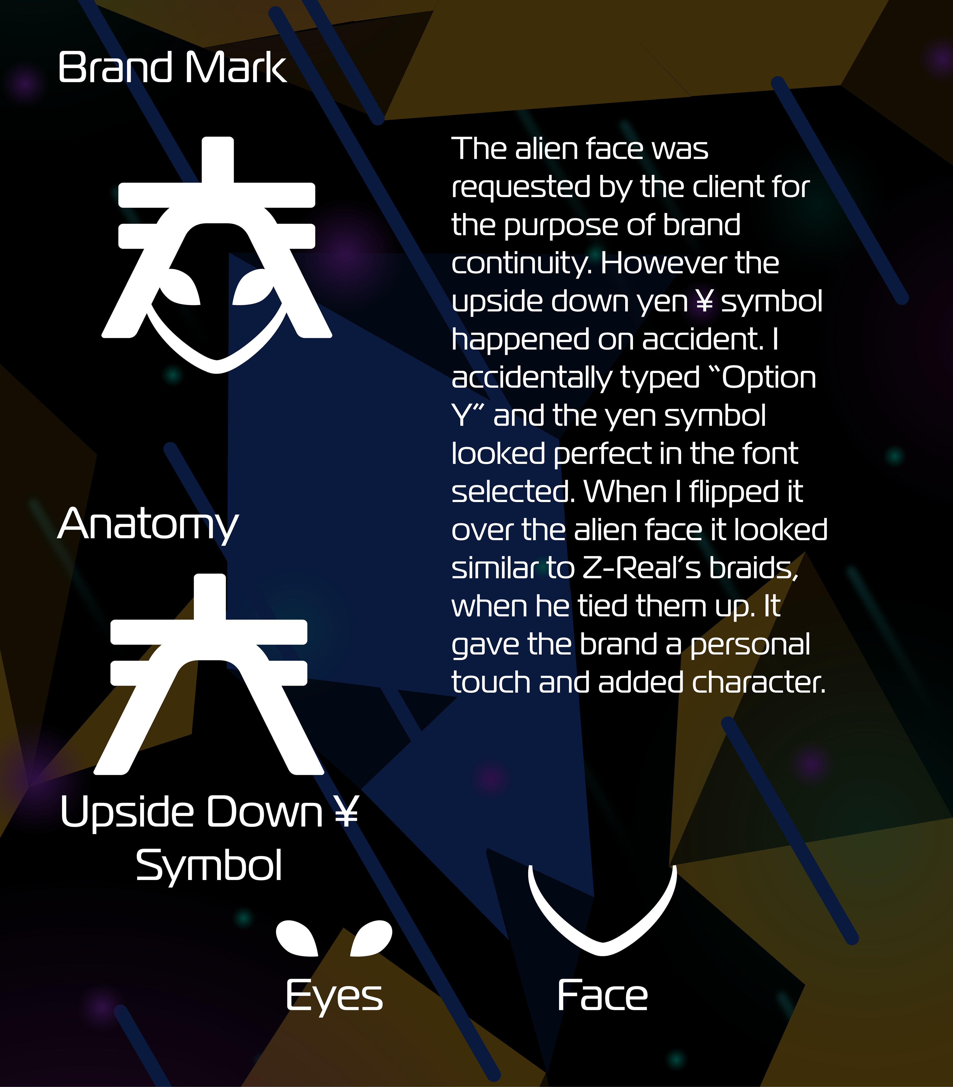
The alien face was requested by the client for the purpose of brand continuity. However the upside down yen ¥ symbol happened on accident. I accidentally typed “Option Y” and the yen symbol looked perfect in the font selected. When I flipped it over the alien face it looked similar to Z-Real’s braids, when he tied them up. It gave the brand a personal touch and added character.
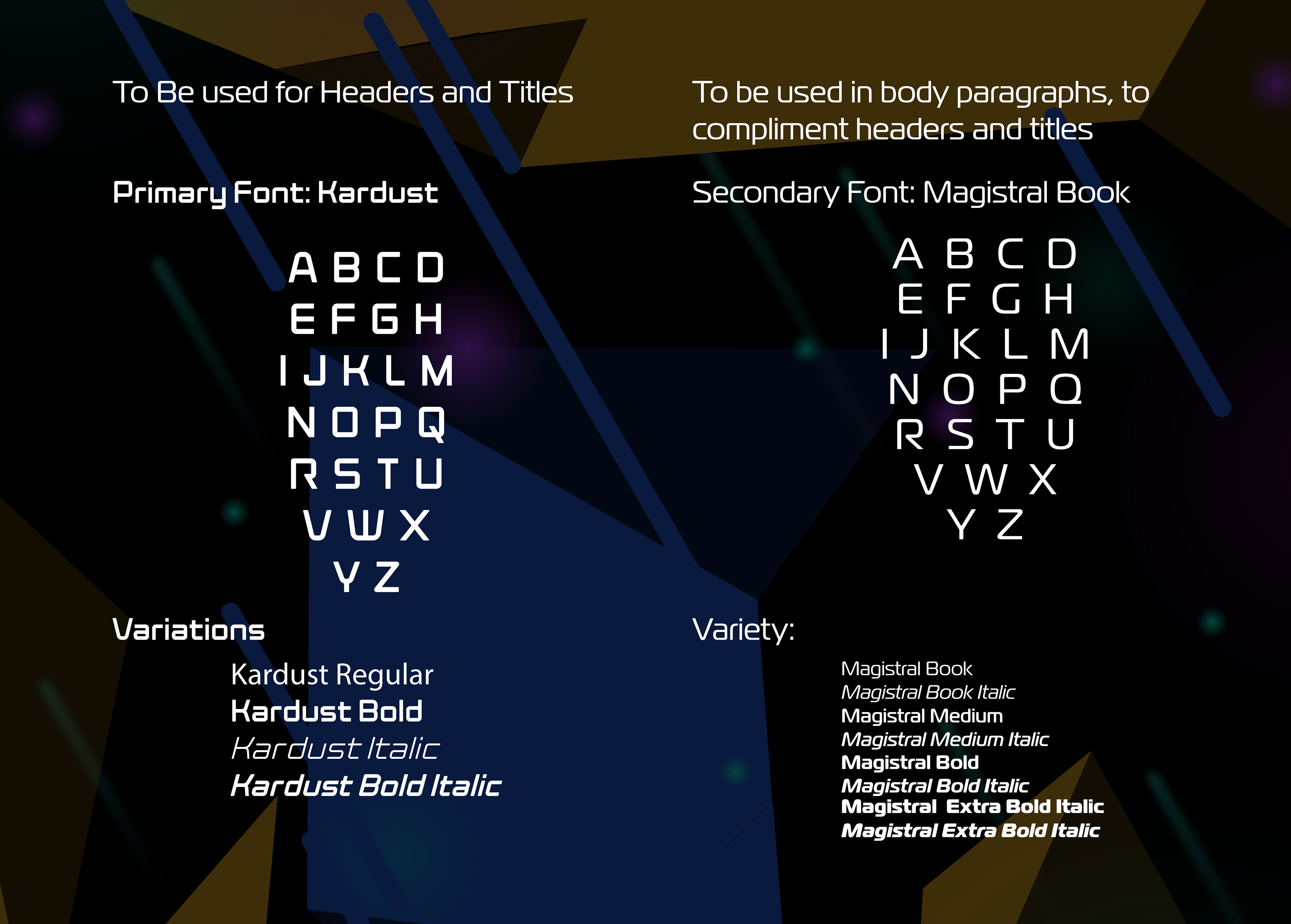
I chose the fonts to not only pair with the AI generated logo, but to also be used for a wide variety of applications. Z-Real is a multifaceted producer that works in a variety of fields related to the music industry. I wanted his brand to be malleable and useful in any situation that he would need to use it.
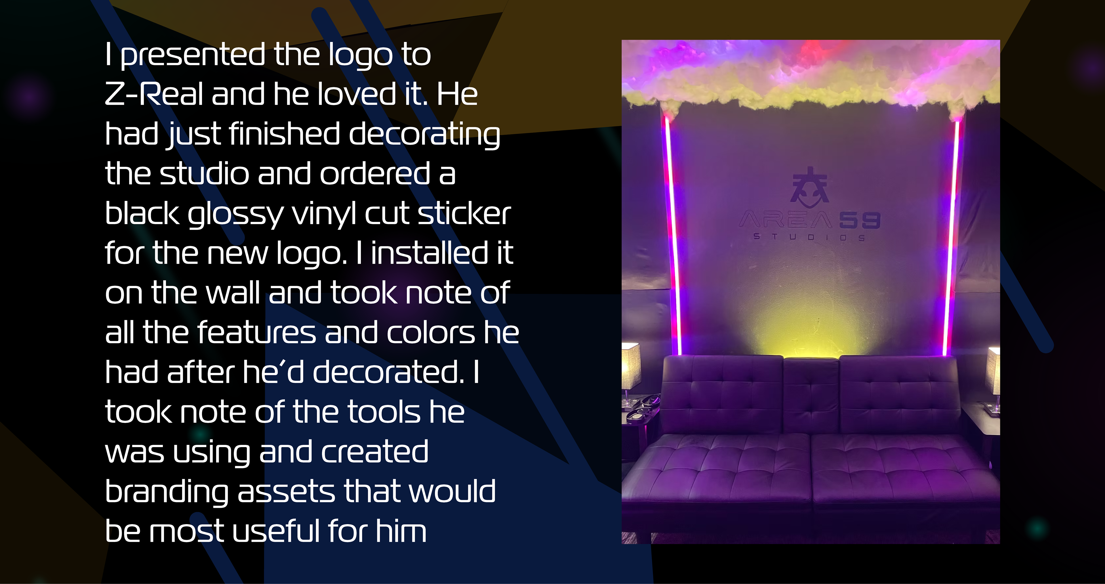
I presented the logo to Z-Real and he loved it. He had just finished decorating the studio and ordered a black glossy vinyl cut sticker for the new logo. I installed it on the wall and took note of all the features and colors he had after he’d decorated. I took note of the tools he was using and created branding assets that would be most useful for him
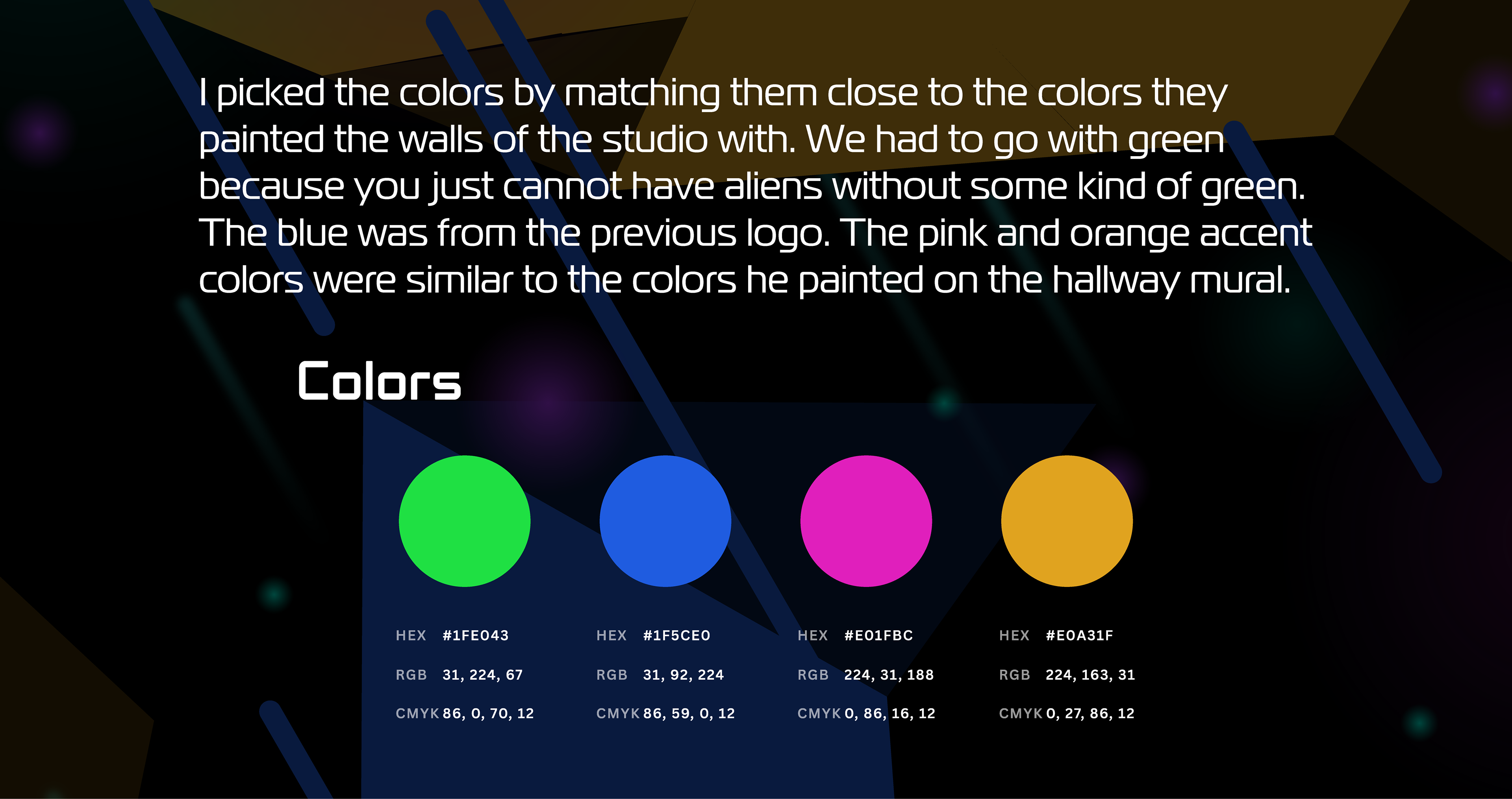
I picked the colors by matching them close to the colors they painted the walls of the studio with. We had to go with green because you just cannot have aliens without some kind of green. The blue was from the previous logo. The pink and orange accent colors were similar to the colors he painted on the hallway mural.
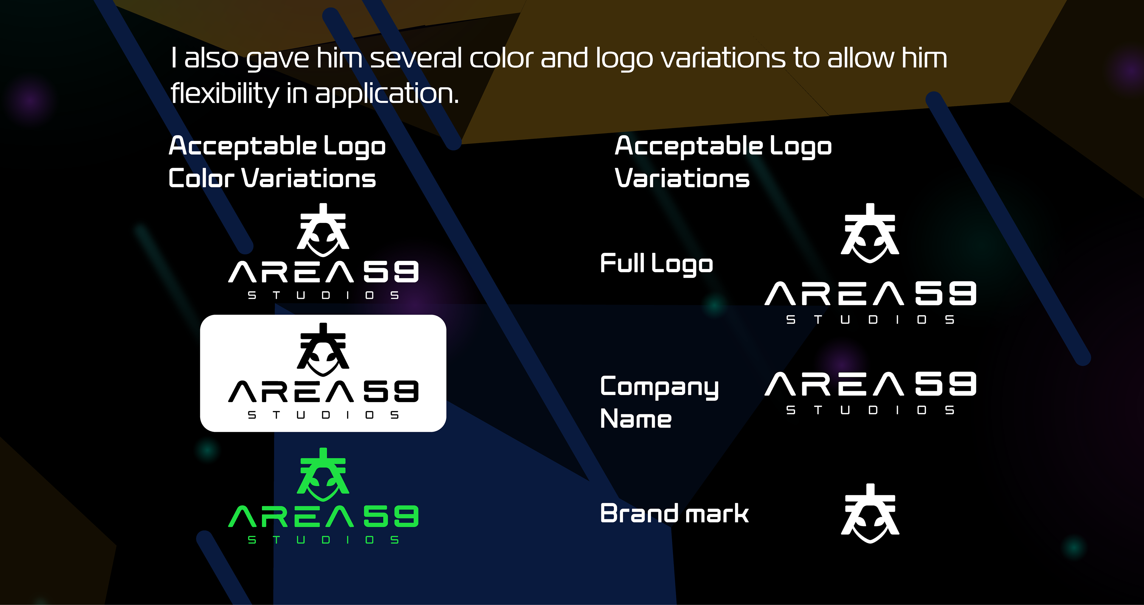
I also gave him several color and logo variations to allow him flexibility in application.